


Brandbook
This page contains our brand guide and all the necessary details for the overall visual communication.
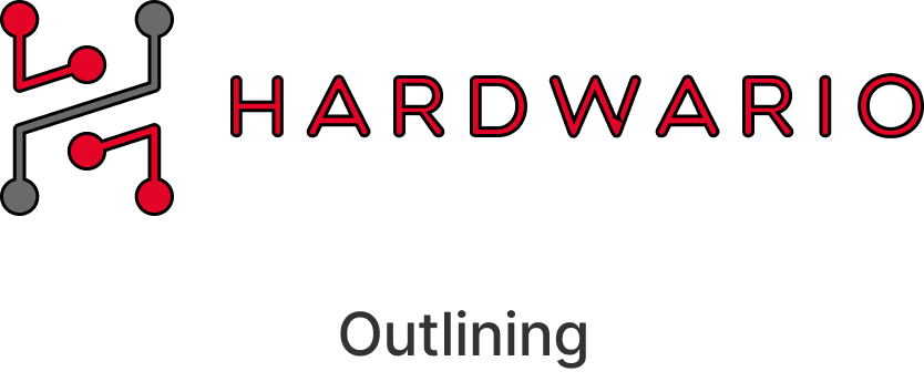
Primary and alternate version
Whenever possible, use the primary version of our logo. In the full-colour version, always keep the grey element. Use the overall white version when placing the logo on dark backgrounds. The alternate, vertical lock-up puts emphasis on the logomark.
DownloadBlack and white
Sometimes, brand identity is placed on undefined light or dark backgrounds, where the use of full-colour logo isn’t possible. In such situations, use the monochrome versions of our logo.
DownloadRecommended clear space
Keep the logo separated from any other visual elements by a distance of at least the width of the logomark.
Primary Color Palette
These are our primary colours. The main colour for communication is bright blue. Never use pure black for the text. Instead, substitute it with the darkest shade of the palette or grey.
Practices to be avoided


Primary font
Inter is our primary font. It is an evolution of Roboto, font previously used by HARDWARIO. You may easily download it from Google Fonts. Moreover, you may use all its styles but never use more than three styles in a given context. It is suggested that you mostly choose between BOLD / SEMIBOLD / MEDIUM / REGULAR.
Download from Google FontsInter
Aa
ABCDEFGHIJKLMNOPQRSTUVWXYZ
abcdefghijklmnopqrstuvwxyz
1234567890.,!?&()*"'%@
This is
a headline.
And this is a subhead.
And here is some body copy. Modi qui dero offici- et quati te moluptatem volorrorum reritatio et que non cor. Ibus utatemporum Aximinctecto quiscie nimodio rrorisciam, sitati am, officienis re volluptae dunt, istempelis ne vellitius volorep.
Learn moreThis is
a headline.
And this is a subhead.
And here is some body copy. Modi qui dero offici- et quati te moluptatem volorrorum reritatio et que non cor. Ibus utatemporum Aximinctecto quiscie nimodio rrorisciam, sitati am, officienis re volluptae dunt, istempelis ne vellitius volorep.
Learn more